RSS

Category Archives: Uncategorized

Sketchbook

This time I will try another sample of colour analysis from a photograph.

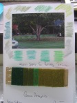
The season being autumn I have chosen some lesser than warm colours in various shades and tones of green. These green colours are both ends of the spectrum that is blue/green and yellow/green.The photo has a matt finish to it so that the greens are more muted and dull looking than than they appear in natural day light. Not only have I used water coloured paints but also snippets of images from coloured magazines and yarn wound onto cardboard in approximately the same proportions as in the photo to show the relationship between the photo and the materials.

Water colours have a serenity about them when being applied which helps me to develop a fairly standard format as suggested in the lessons but I want to vary my way of analysing colour perhaps by trying a drawing/sketch and using a variety of materials and fibres.

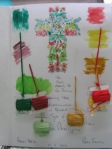
Still with the autumn shades but introducing some warmer colours such as red and yellow. By taking a series of flower shapes and sketching them in pencil I added the full strength colours from water coloured paints. The slender and spindly lines suggests I use a lower denier of thread and I have chosen DMC thread shades which match the colours in the drawing. The warm reds and yellows contrast strongly with the cool greens and all their different tones. The duller greens stand out in intensity because of their clean cut lines, especially their outlines and hash texture markings. The greens appear darker because of the value of the yellow and reds surrounding them.

I tend to work intuitively rather than by analysis of the concepts of colour and techniques other than collage. It still is and will for some time yet be a voyage of discovery for me as a student. I hope that I never stop learning something new.

 
Comments Off on Sketchbook

Posted by on March 15, 2012 in Sketchbook


Sketchbook

  Documenting sketchbook work to date.

Merry Xmas

 
Comments Off on Sketchbook

Posted by on December 23, 2011 in Sketchbook


Sketchbook

Part Two: Project Four – In your sketchbook

Having just viewed Pat Hodson’s review of textile student Jackie Ward’s sketchbook http://news@oca-uk.com I will now have no excuses for not emulating her presentation for assessment.

The first obvious feature of her presentation is that it is all in a ‘fixed’ binder/notebook. Completing and controlling work in this form of sketchbook I find is @#$%^& difficult. Below my entry is all on loose sheets of A3 110gsm paper which can be either bound or held together with binder clips/rings for presentation to tutors and/or assessors.

The second obvious feature is that when presenting work that is not necessarily the ‘final’ work but a selection of work that can be something other than the work that was done last it may well have to be torn out of the middle of a ‘fixed’ sketchbook.

 The first two images were chosen because of the contrasting light and dark shadings so that a comparison could be made between the various marks and colours. The image on the right was as a result of cutting three drawings into strips and interlacing them in a woven pattern. The result needs to be looked at from a distance in order to see the greater patterns and blocks of colour. Changing the scale of the image helps to clarify less meaningful marks and makes others more emphatic for further evolution.

 A closeup and distant visual of an 8cm framed segment prior to enlargement and additional resolution. The outlines and squares are predominant and will need to be redrawn to show aspects other than geometrical shapes, depending of course on how the designer perceives an outcome of the chosen segment. The method used of weaving the slips of paper together gives structure and purpose to this exercise. Highlighting a small segment tends to isolate features that can be confusing when looking at the greater picture. Once again the colours black and white act as highlighters whereas the primary colours stand out just waiting to be composed further into designs which merge with a measure of staccato rhythm.

 Showing a selection of the 8cm square chosen for enlargement and the base image from where other 8cm squares have been taken. The image on the left shows extreme markings of texture and undulating material. This was created with heat being applied to coloured plastic flower wrapping paper and then acrylic paint used on the surface.It has a raised surface/relief which adds another dimension to my work that has been mostly on a flat paper surface.

 By using a double panel  of mirrors at different angles various compositions are able to provide patterned pieces which lend themselves admirably to be developed in patchwork and quilting. The simple application of the mirrors becomes a valuable encouragement to working further with graph paper and/or computer aided designs ending up as either embroidery designs, hand stitched motifs or bed quilts to mention only a few options. Placing the mirrors at right angles or a variation of positions creates  a sense of excitement in itself. I felt a great sense of achievement as I saw the possibilities especially in a wide choice of colours and painting sticks.


Cut and paste both on the computer and with scissors and paper are a meaningful way to create designs tantamount to deciding which ones lend themselves or are chosen to be stitched and/or sewn out. I am really chuffed about these exercises I think I am getting some where at last – well along the lines that I believe I should be developing designs. I am building up a great body of work at this stage with the exploration process being the main driver. I am not afraid to develop and use as many mediums as possible and as many new tools that I can lay my hands on. These images are only a selection of my current work with the purpose of showing how my work is evolving towards resolution and finished pieces.

Stumpage is a technical and commercial term for the value of a growing tree. Once the trunk is felled however death and decay set in and provide a feast of images which can be metamorphed into samples and experiments by textile and fibre artists.

Death and decay captured in water colour and black ink pen.

Mixed hand and machine sampling of textures and shapes on the face of the felled tree trunk. Strips of demin were woven into a piece of fabric and stitched on to hessian.

Trialling colour mixes and recipes for resolution of sampling.

Pattern forming so that the growth rings could be developed further into some form of wall hanging.


Comments Off on Sketchbook

Posted by on November 29, 2011 in Sketchbook


Sketchbook

Realising that 20% of my marks involves Sketchbook and Reflective Journal work I have persevered by spending 10 minutes plus in my sketchbook carrying out an optional exercise in colour recognition. As previously noted the printer was set on ‘reduced ink’ so the outcome was as a consequence of seeing colours not connected with the original photo. Choosing and mixing will have to be an ongoing process with water colours as they do move in and out of the proposed shades. Will have to make a change from 110gsm paper to a better quality if I am to avoid the distressing element as a result of applying water to the paper surface.

Adhering to the module prompting of ‘don’t try to make finished drawings – just record colours and colour combinations’ Obviously primary colours greet the eye much more easily than diffused colourings. This exercise is very infectious I just want to keep keeping on with more samples so that the learning becomes empowering.

These uploaded images are just two of many that I have in my Sketchbook now.

 
Comments Off on Sketchbook

Posted by on November 8, 2011 in Sketchbook


Sketchbook

Keeping a sketchbook will require me revisiting the comments made by my tutor in Visual Studies with the Julia Caprara School of Textiles: “for the future, continue to develop your free drawing ability, and experimental mixed media approach working directly into sketchbooks with good quality paper, try working on a larger scale, filling the whole page and record brief notes about your work more informally into your sketchbook so that the process becomes intuitive, saving more formal analysis for reporting and final assessments”.

 This will require me to move from a port-folio type presentation and to take up the OCA requirements with a view to making this process part of ones daily (ten minutes)  work schedule as does any practicing textile artist.Observation being the key to interpreting and performing this occupational task.

(to be continued)

 
Comments Off on Sketchbook

Posted by on November 1, 2011 in Sketchbook


Part Two: Project Three – Stage Two. Exercise 2.

Project Three: Stage Two – Exercise 2.

 I had to concentrate extremely hard making sure I was able to cut out all the peripheral sensations before I made up my mind that I was seeing some variation but not that easily. I was not sure whether I was experiencing a vision or the actual image. The harder I concentrated the longer it seemed to stay in my mind at least that is after the exposure to the original. Shades of being asleep but still convinced that the dream and its images are real – at least in the “morning after the night before”. One thing I am certain though is that the All Blacks won the world cup in rugby.

Looking at the colours for a reasonable length of time meant that I started to see another hue around the periphery. Sometimes the fleeting colour seemed to float on the top of the original colour; it even seemed to linger on top of the surrounding colours. Although the colour was always elusive in my mind’s eye it reinforced for me the phenomenon of ‘after image’.

I tried the experiment at http://www.worqx.com/color/after_image.htm copy and post the URL in your browser. Quite rivoting – aye

 
Comments Off on Part Two: Project Three – Stage Two. Exercise 2.

Posted by on October 26, 2011 in Part Two: Project Three - Stage Two. Exercise.2., Uncategorized


Part Two: Project Three – Stage Two. Exercise 1.

Project Three: Stage Two – Exercise 1.

How fascinating to move the samples backwards and forwards creating an illusion of the colour changes – minimal but sufficiently enough to be aware of the subtle variation in each one.

A further extension of the subject of Colour Illusions can be seen at: www.psy.ritsumei.ac.jp/~akitaoka/AIC2009.html copy and post the URL in your browser.

A much broader appreciation by seeing the various colours in techno colour and with moving components – aye.

The above samples show the colours orange and green in the centre of each of the five squares and on their own. I have noticed that the orange and green when placed on colours of greater value appear cooler whereas when placed on colours of lesser value they appear warmer. This seems to be as a result of the surrounding colour projecting its complement on to the centre piece/colour.

 
Comments Off on Part Two: Project Three – Stage Two. Exercise 1.

Posted by on October 26, 2011 in Part Two: Project Three - Stage 2. Exercise 1., Uncategorized


Part Two: Project Three – Stage 1.

 Stage 1. Introduction and preparation

Sir Isaac Newton taught us that without light there is no colour and by share observation as darkness descends, colour diminishes. The primary hues of red, blue and yellow we are told cannot be created by mixing any other secondary or tertiary colours. When mixed together red and blue become violet;yellow and blue become green; and red and yellow become orange – as portrayed in the photo of a six (6) colour-colour wheel made from cotton patchwork fabrics:

The six-colour circle involves big jumps in hue.

 In order to reproduce the segments of the wheel I first started by drawing the design to scale on graph paper. The resulting shapes plus a 1/4″ seam became the templates for cutting out the pieces of fabric in the appropriate colours. Piecing the segments together and adding a black border created a visual concept of the six-colour wheel. I took some time in selecting the various colours in fabric as they were just not available off the shelf.

 Mixing the primary colours in Gouache paint was not as simple as it sounded and ended up looking messy. 110gsm paper is not strong enough for working on both the front and its back side. Vivid black markers are to be avoided as the ink penetrates poorer quality of paper and can disfigure work on the reverse side.

To get nearer to a smoother transition I tried mixing colours next to each other to get an in between colour.

The colour wheel is the basic tool for combining colours.

The most common version is a wheel of twelve colours again reproduced here in visual form from cotton patchwork fabric. Getting the sewing machine out at least means that one’s handiwork can be admired. The black border accentuates the twelve colours but if the centre piece had been white it could have demonstrated the principle that when three primaries are combined, white light is seen because all colour is reflected.

Trying to mix  colours together was less successful than I imagined it would be. The intention was to mix yellow red and blue and also green red and blue to see what colour would emerge as they overlapped. I assumed that where the three colours overlapped that I would end up with a colour akin to black or white. I need to rethink this experiment as although the paints were wet they did not in fact mix as well as if I had worked them together on a palette. At least I tried and had good intentions. I think I was more impressed with the curious surprises and the happy accidents than the frustration of the outcomes.

So that I had a record of the principles of colour mixing I photo copied notes on basic colour mixing schemes for further reference and pasted them in my sketchbook.

and just in case I need them later on I have purchased two aids/tools to help me select colours for perfect combinations every time and guide me in mixing colours:

I used a commercial set of water coloured paints under the name of “Maries’ which didn’t really mean anything at this stage. I surmise that I will become more particular once I have a better appreciation of the market and what paints and brushes are preferred by practicing artists. I will start to become more proficient in using and recording weight, volume and unit measures when mixing paints so that when I decide on a reproducing a particular colour I can go back and be sure of getting the same results as was the first mixture. Working with mixing tools such as tooth picks, cotton buds and ice cream sticks was not accurate enough to replicate special colours because I could not control the outcome.

It would appear that the outcomes are determined by my mind’s eye and the pleasure I derive from seeing an image or colour visually rather than an exact reproduction from a photo, image or object. Compare Rothko’s dense layering of paint to Seurat’s brush strokes and there are major differences – I know which paintings I prefer but reading the art historians revues and the different opinions will also become obvious as do the artists narratives of the works they present for galleries or exhibitions.

As for looking up the paintings by the French Impressionists and not having the benefit of seeing them in the raw but on a computer screen , it is not possible to see the brush markings whether they be dots as in pointillism or brush strokes as in a Monet. Will have to look more closely for English and French originals in an art gallery, but not possibly in New Zealand unless they are originals by New Zealand artists. Looking up such aspects as spatial illusions does not help that much unless one is willing to spend time studying the language and physics of textile and fine arts.

Any one colour be it primary, secondary or tertiary is not of the same hue family but can be of the same ‘value’ in terms of its shade be it light, dark or in between. Any colour can be of the same degree of saturation, be it shiny or dull. For example a green can have the same value or saturation as an orange.


Take a colour photo for example and copy it in black and white on a photo copier and immediately one can see the different values of the colours in a grey scale.


I agree that the eye does the mixing and interpretation of colours in a painting and that comes down to personal preference, hence the saying that beauty is in the eye of the beholder, not what you think is there but what your eye tells you is there. ‘Of the three ways to describe a colour, value is the most important because it is the first characteristic of a design that can be seen from any distance, and it remains important even at close range’. (Menz.2004)

 
Comments Off on Part Two: Project Three – Stage 1.

Posted by on October 26, 2011 in Uncategorized


Part Two: Project Three – Stage Three.

Project Three: Stage Three.

Recording colours accurately using a more invasive colour wheel

 
Comments Off on Part Two: Project Three – Stage Three.

Posted by on October 26, 2011 in Part Two: Project Three - Stage Three., Uncategorized


Bibliography

Boschert, D. et al. (2011). Twelve by twelve: the international art quilt challenge. New York. U. S. A: Lark Crafts.

Colchester, C. (2007). Textiles today: a global survey of trends and traditions. London,United Kingdom: Thames & Hudson.

Country Bumpkin Publications. (2005). A to Z of embroidery stitches. Malvern, South Australia: Inspiration Books.

Caprara. J. (2008). Exploring colour: experimental approaches to colour and stitch. d4daisy books ltd.

 Green, J. D. (1993). Arteffects. New York, United States: Watson-Guptill.

 Greenlees, K. (2005). Creating sketchbooks. London, United Kingdom: Batsford, B. T. Ltd.

 Harris, J. (2004). 5000 years of textiles. London, United Kingdom: British Museum publications.

 Hedley, G. (2010). Drawn to stitch. London, United Kingdom: Batsford, B. T. Ltd.

 Howard, C. (1979). The Constance Howard book of stitches. London, United Kingdom: Batsford, B. T. Ltd.

 Howard, C. (1966). Inspiration for embroidery. London, United Kingdom: Batsford, B. T. Ltd.

 Johnston, A. (1999). The Quilters book of design. Illinois. U.S.A: NTC/Contemporary Publishing Group.

 Menz, D. (2004). Color works. The crafters guide to color. Colorada, USA: Interweave Press.

Packer, A. (2006). Stitch: contemporary New Zealand textile artists. Auckland. New Zealand: Random House.

Schoeser, M. (2003). World textiles: a concise history. London. U.K.: Thames & Hudson Ltd.

 Thittichai, K. (2011).  Layered textiles. New surfaces with heat tools, machines and hand stitching.            London. U.K: Batsford.

 Twinn, J. (2011). Colour in art quilts. London. U.K: Batsford.

 Wolfrom, J. (1992). The magical effects of colour. California. USA: C & T Publishing

 
Comments Off on Bibliography

Posted by on October 24, 2011 in Bibliography